JQuery UI Theming/API


UI/Theming/API

From jQuery JavaScript Library

Jump to: navigation, search

« Back to jQuery UI Theming

Contents

  • 1 The jQuery UI CSS Framework

[edit]

The jQuery UI CSS Framework

jQuery UI includes a robust CSS Framework designed for building custom jQuery widgets. The framework includes classes that cover a wide array of common user interface needs, and can be manipulated using jQuery UI ThemeRoller. By building your UI components using the jQuery UI CSS Framework, you will be adopting shared markup conventions and allowing for ease of code integration across the plugin community at large.

[edit]

Framework Classes

The following CSS classes are split between ui.core.css and ui.theme.css, depending on whether styles are fixed and structural, or themeable (colors, fonts, backgrounds, etc) respectively. These classes are designed to be applied to User Interface elements to achieve visual consistency across an application and allow components to be themeable by jQuery UI ThemeRoller.

[edit]

Layout Helpers

  • .ui-helper-hidden: Applies display: none to elements.
  • .ui-helper-hidden-accessible: Applies accessible hiding to elements (via abs positioning off the page)
  • .ui-helper-reset:  A basic style reset for UI elements. Resets things such as padding, margins, text-decoration, list-style, etc.
  • .ui-helper-clearfix: Applies float wrapping properties to parent elements
  • .ui-helper-zfix: Applies iframe "fix" css to iframe elements when needed in overlays.

[edit]

Widget Containers

  • .ui-widget: Class to be applied on outer container of all widgets. Applies font family and font size to widget. Also applies same family and 1em font size to child form elements specifically, to combat inheritance issues in Win browsers.
  • .ui-widget-header: Class to be applied to header containers. Applies header container styles to an element and its child text, links, and icons.
  • .ui-widget-content: Class to be applied to content containers. Applies content container styles to an element and its child text, links, and icons. (can be applied to parent or sibling of header)

[edit]

Interaction States

  • .ui-state-default: Class to be applied to clickable button-like elements. Applies "clickable default" container styles to an element and its child text, links, and icons.
  • .ui-state-hover: Class to be applied on mouseover to clickable button-like elements. Applies "clickable hover" container styles to an element and its child text, links, and icons.
  • .ui-state-focus: Class to be applied on keyboard focus to clickable button-like elements. Applies "clickable hover" container styles to an element and its child text, links, and icons.
  • .ui-state-active: Class to be applied on mousedown to clickable button-like elements. Applies "clickable active" container styles to an element and its child text, links, and icons.

[edit]

Interaction Cues

  • .ui-state-highlight: Class to be applied to highlighted or selected elements. Applies "highlight" container styles to an element and its child text, links, and icons.
  • .ui-state-error: Class to be applied to error messaging container elements. Applies "error" container styles to an element and its child text, links, and icons.
  • .ui-state-error-text: An additional class that applies just the error text color without background. Can be used on form labels for instance. Also applies error icon color to child icons.
  • .ui-state-disabled: Applies a dimmed opacity to disabled UI elements. Meant to be added in addition to an already-styled element.
  • .ui-priority-primary: Class to be applied to a priority-1 button in situations where button hierarchy is needed. Applies bold text.
  • .ui-priority-secondary: Class to be applied to a priority-2 button in situations where button hierarchy is needed. Applies normal weight text and slight transparency to element.

[edit]

Icons

[edit]

States and images

  • .ui-icon: Base class to be applied to an icon element. Sets dimensions to 16px square block, hides inner text, sets background image to "content" state sprite image. Note: .ui-icon class will be given a different sprite background image depending on its parent container. For example, a ui-icon element within a ui-state-default container will get colored according to the ui-state-default's icon color.

[edit]

Icon types

After declaring a ".ui-icon" class, you can follow up with a second class describing the type of icon you'd like. Icon classes generally follow a syntax of .ui-icon-{icon type}-{icon sub description}-{direction}.

For example, a single triangle icon pointing to the right looks like this: .ui-icon-triangle-1-e

jQuery UI's ThemeRoller provides the full set of CSS framework icons in its preview column. Hover over them to see the class name.

[edit]

Misc Visuals

[edit]

Corner Radius helpers

  • .ui-corner-tl: Applies corner-radius to top left corner of element.
  • .ui-corner-tr: Applies corner-radius to top right corner of element.
  • .ui-corner-bl: Applies corner-radius to bottom left corner of element.
  • .ui-corner-br: Applies corner-radius to bottom right corner of element.
  • .ui-corner-top: Applies corner-radius to both top corners of element.
  • .ui-corner-bottom: Applies corner-radius to both bottom corners of element.
  • .ui-corner-right: Applies corner-radius to both right corners of element.
  • .ui-corner-left: Applies corner-radius to both left corners of element.
  • .ui-corner-all: Applies corner-radius to all 4 corners of element.

[edit]

Overlay & Shadow

  • .ui-widget-overlay: Applies 100% wxh dimensions to an overlay screen, along with background color/texture, and screen opacity.
  • .ui-widget-shadow: Class to be applied to overlay widget shadow elements. Applies background color/texture, custom corner radius, opacity, top/left offsets and shadow "thickness". Thickness is applied via padding to all sides of a shadow that is set to match the dimensions of the overlay element. Offsets are applied via top and left margins (can be positive or negative).


源文档 <http://docs.jquery.com/UI/Theming/API>

jqGrid 问题笔记


所谓问题可能不是jqgrid本身问题,而是浏览器或应用的特殊需要而产生的问题。


01.单元格内的文本自动换行


加入样式:


.ui-jqgrid tr.jqgrow td {

    white-space: normal !important;

    height:auto;

    vertical-align:text-top;

    padding-top:2px;

}


具体说明可参阅: http://blog.qumsieh.ca/2009/12/03/jqgrid-textword-wrapping/


02.保持显示垂直滚动条


在IE中记录比较少的时候,默认情况下不显示垂直滚动条,会出现标题行与数据行位置对不齐的情况,通过保持显示垂直滚动条可以解决这个问题。


    $( pGridId ).closest(".ui-jqgrid-bdiv").css({ 'overflow-y' : 'scroll' });


需要保持水平滚动条,则:

    $( pGridId ).closest(".ui-jqgrid-bdiv").css({ 'overflow-x' : 'scroll' });


03.控制列的水平宽度


当表字段比较多时,如果按照colModel指定的宽度,整个jqGrid宽度会太宽,我们通常希望控制一下grid的宽度,并同时保持各列的指定宽度。

可以指定jgrid的参数 shrinkToFit:false shrinkToFit属性用来说明当初始化列宽度时候的计算类型,如果为ture,则按比例初始化列宽度。如果为false,则列宽度使用colModel指定的宽度。

同时需要控制jqgrid的宽度。通过autowidth:true属性可以达到目地。


04. 高度随记录数自动变化.


使用 height: 'auto' 参数 .


不理想的是,在IE6中,当字段比较多并出现水平滚动条时,感觉会比较难受。参考保持垂直滚动条的办法,保持一个水平滚动条,高度是对了。( 使用的Firefox3.6没发现这个问题, 所以说IE比较烂并不是空穴来风 )


Js代码

  1. if($.browser.msie) {      
  1.     // 保持垂直滚动条   
  1.     // $( pGridId ).closest(".ui-jqgrid-bdiv").css({ 'overflow-y' : 'scroll' });    
  2.     // 保持水平滚动条  
  3.     $( pGridId ).closest(".ui-jqgrid-bdiv").css({ 'overflow-x' : 'scroll' });    
  4. }  


05. jqgrid 和 validation 插件一起使用的问题


在提交表单的时候,会报错:'settings' is null or not an object.  'setting'为空或不是对象


http://www.trirand.com/blog/?page_id=393/help/jqgrid-validation-plugin-issue/ 有这样的问题报告,


目前还是有这样的问题。


06. 动态修改 jqgrid 提交的参数 


具体的说明可以参考 http://www.trirand.com/jqgridwiki/doku.php?id=wiki:post_data_module  


这里举个例子:当你需要根据用户的输入过滤 jqgrid 的显示数据,可以这样实现,


Js代码

  1. userName = $( '#userName' ).val( );   // input 的值  
  1.   
  1. userCode =  $( '#userCode' ).val( );   // input 的值  
  2.   
  1. jQuery('#grid_user').appendPostData( { userName :userName , userCode :userCode }   
  1.   
  2. 这样,刷新 grid 数据时,提交到服务器的数据将包含这 userName 和 userCode两项。  


07. Editing form 提交时,动态添加数据项 


在以 Form Editing 方式添加或修改数据,如何在提交时动态的添加或修改一些项目呢?


一个典型的例子是添加文章记录时,在提交的数据中添加当前时间这个项目。


参考 http://www.trirand.com/jqgridwiki/doku.php?id=wiki:form_editing 可以知道:


在表单提交前,将触发事件 beforeSubmit 所以我们可以在这个事件里做些事情。


Js代码

  1. // 提交前  
  1. fn_beforeSubmit = function( postdata, formid ) {   
  1.     // 添加或修改 postdata 项目值             
  1.     postdata[ 'uploadDate' ] = new Date().format("yyyy/MM/dd") ;    
  1.     postdata[ 'uploadTime' ] = new Date().format("hh:mm:ss") ;    
  1.                                           
  1.     return[true,''];   // 提交  
  1.                           
  1. };  
  1.   
  1. // 添加记录 options   
  2. Options_add = {  
  3.         width:500,  
  4.         height:290,  
  5.         reloadAfterSubmit:true,  
  1.         jqModal:true,   
  1.         beforeSubmit:       fn_beforeSubmit,  
  1.         ......  
  2. }  
  3.   
  1. // 配置 jqgrid nav  
  2. jQuery( pGridId ).jqGrid('navGrid',pPageId, {edit:true,add:true,del:true,search:false,refresh:true,view:true,addtext:'添加',edittext:'修改',deltext:'删除' }, //options   
  1.         {height:290,reloadAfterSubmit:false, jqModal:true, closeOnEscape:true, bottominfo:"标记有*的字段不能为空"}, // edit options   
  1.         Options_add, // add options   
  1.         {reloadAfterSubmit:false,jqModal:true, closeOnEscape:true }, // del options   
  1.         {closeOnEscape:true}, // search options   
  1.         {height:250,jqModal:false,closeOnEscape:true} // view options   
  1.     );   


08.  Editing form 中上传文件 


待续 ......


09.  不显示中间的分页器或右边的记录信息 


通过 FireBug可以发现 jqgrid  pager中各部分的命名规则: pager id + _left/_center/_right


pPageId = '#pager_grid' ;

$( pPageId + "_center" ).remove( );    // 删除中间分页器


另外,也可以通过控制 css 实现。


参考:

 jqgrid  Tips, Tricks and Hacks -  To use the nav bar for buttons but hide the pager, using CSS

10 JQGrid Tips learned from my experience - tip5,tip6


10.  取得记录行序号 


jqGrid提供的方法一般只能取得记录的 id 号。使用 $('#jqgrid1').jqGrid('getDataIDs') 方法可以获得各行的id数组,此数组相应元素的索引号就是记录行序号了(0开始)


可以参考:

http://www.trirand.com/blog/?page_id=393/help/to-get-the-rowid-of-the-nth-row-of-the-grid/


Found the answer using $('#gridmain').jqGrid('getDataIDs');

It will return an array of ids for the visible grid.

So to get the nth rowid, i use:

var rids = $('#gridmain').jqGrid('getDataIDs');

var nth_row_id = rids[n-1]; //bec the row array starts from zero.

Hope it will help others, if interested.


其他参考:


10 JQGrid Tips learned from my experience

http://veechand.wordpress.com/2009/07/13/10-jqgrid-tips-learned-from-my-experience/


jqGrid and JQuery UI tabs showing grids expanded only on primary tab (div)


http://stackoverflow.com/questions/2117687/jqgrid-and-jquery-ui-tabs-showing-grids-expanded-only-on-primary-tab-div


源文档 <http://forestkqq.javaeye.com/blog/602944>

YUI Grids布局原理

YUI Grids布局原理

(对外版)

主要内容

  • 学习使用YUI Grids布局

布局

  • 布局是网页的骨架,网页开发的第一步
  • 结构 模块 最终页面

不同的布局思路

(照片出自http://flickr.com/photos/ckalinw/)
(照片出自http://flickr.com/photos/my_soul_insurance2004/)
实例 实例

YUI Grids的好处

  • 解决重复劳动
  • 稳定
  • 黑盒系统
  • 自由安排内容的下载顺序
  • ~4K,支持>1000种页面布局
  • 适应所有IAB广告标准

开始

<body>
<div>
<div id="hd"> </div>
<div id="bd"> </div>
<div id="ft"> </div>
</div>
</body>
一个页面的最原始结构

引用YUI Grids CSS文件
<link rel="stylesheet" type="text/css" href="http://cn.yui.yahooapis.com/2.5.2/build/reset-fonts-grids/reset-fonts-grids.css">

第一步:决定页面的宽度(1)

<body>
<div id="doc">
<div id="hd"> </div>
<div id="bd"> </div>
<div id="ft"> </div>
</div>
</body>
  • #doc - 750px居中 (适合800x600)
  • #doc2 - 950px居中 (适合1024x768)
  • #doc3 - 100%液态 (适合everybody)
  • #doc4 - 974px居中 (适合1024x768)
  • #doc-custom - 自定义宽度

第一步:决定页面的宽度(2)

<body>
<div id="doc-custom">
<div id="hd"> </div>
<div id="bd"> </div>
<div id="ft"> </div>
</div>
</body>
<style> div#doc-custom{width:960px;} </style>

第二步:划分基本的内容块(1)

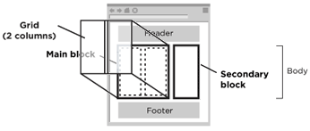
任何结构的页面都可划分为Main block和Secondary block。

第二步:划分基本的内容块(2)

<div id="bd"> 
<!--start: 财经要闻 {> ... <!--} end: 财经要闻>
<!--start: 证券要闻 {> ... <!--} end: 证券要闻>
<!--start: 理财消费 {> ... <!--} end: 理财消费>
<!--start: 能人观点 {> ... <!--} end: 能人观点>
<!--start: 最新股票 {> ... <!--} end: 最新股票>
<!--start: 收益排行榜 {> ... <!--} end: 收益排行榜>
</div>

第二步:划分基本的内容块(3)

<div id="bd"> 

	<div class="yui-b"> 
		<!--start: 财经要闻 {> ... <!--} end: 财经要闻>
		<!--start: 证券要闻 {> ... <!--} end: 证券要闻>
		<!--start: 理财消费 {> ... <!--} end: 理财消费>
	</div>

	<div class="yui-b"> 
		<!--start: 能人观点 {> ... <!--} end: 能人观点>
		<!--start: 最新股票 {> ... <!--} end: 最新股票>
		<!--start: 收益排行榜 {> ... <!--} end: 收益排行榜>
	</div>

</div>

第二步:划分基本的内容块(4)

<div id="bd"> 

	<div id="yui-main"> 
		<div class="yui-b"> 
			<!--start: 财经要闻 {> ... <!--} end: 财经要闻>
			<!--start: 证券要闻 {> ... <!--} end: 证券要闻>
			<!--start: 理财消费 {> ... <!--} end: 理财消费>
		</div>
	</div>

	<div class="yui-b"> 
		<!--start: 能人观点 {> ... <!--} end: 能人观点>
		<!--start: 最新股票 {> ... <!--} end: 最新股票>
		<!--start: 收益排行榜 {> ... <!--} end: 收益排行榜>
	</div>

</div>

第三步:选择模板

<body>
<div id="doc" class="yui-t1">
<div id="hd"> </div>
<div id="bd"> 
......
</div>
<div id="ft"> </div>
</div>
</body>

.yui-t1 - 2栏, 窄栏在左侧, 160px
.yui-t2 - 2栏, 窄栏在左侧, 180px
.yui-t3 - 2栏, 窄栏在左侧, 300px
.yui-t4 - 2栏, 窄栏在右侧, 180px
.yui-t5 - 2栏, 窄栏在右侧, 240px
.yui-t6 - 2栏, 窄栏在右侧, 300px
 

小结一下

  • 第1步 第2步
  • 第3步 第4步
  • 第5步 效果

内嵌布局

  • 内嵌布局
  • 格子Unit (.yui-u)
  • 网格Grid (.yui-g, .yui-gb, .yui-gc, .yui-gd, .yui-ge, .yui-gf)
  • 首格子 (.first)

网格类型

  • 两列
    .yui-g 1/2 - 1/2 (均匀分布)

    .yui-gc 2/3 - 1/3
    .yui-gd 1/3 - 2/3
    .yui-ge 3/4 - 1/4
    .yui-gf 1/4 - 3/4
  • 三列
    .yui-gb 1/3 - 1/3 - 1/3 (均匀分布)

使用Grids

  • 实例
  • ~2分钟
  • Grids的灵活性: 演示

多段布局(中国特色)

  • 演示
  • 段 (.section)
    .section{margin-bottom:10px;}
    .section:after{content:".";display:block;clear:both;visibility:hidden;height:0;}
    	

Homework

实例

要求:用YUI Grids手写完成上面Mockup的布局效果。

好好学习,天天向上!

Made with Eric A Meyer's S5